
When socio-political awareness gathers to a breaking point, and nerves are raw, and people start getting fed up, fantasy runs into problems. In fraught moments like this, flights of artistic imagination are confronted by lived reality. When artworks—even very good artworks—exist as idealistic echoes of that reality, the conflict quickens.
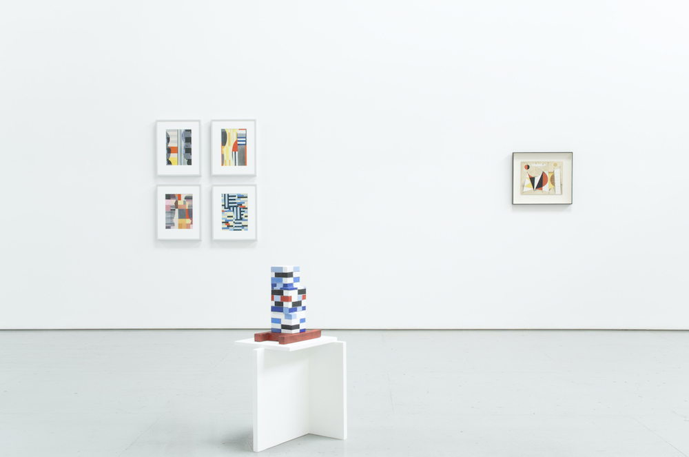
By way of three artists across three generations, Equinox Gallery’s exhibition Leave the Window Open, curated by Sophie Brodovitch, reflected a local line of artistic inheritance, with international resonance. Throughout the last seventy-odd years, a language of painting and sculpture has developed in Vancouver, rooted in a Bauhaus-inflected integration of fine art, architecture, engineering, and design. A central figure in this tradition, B.C. Binning taught for many years at the University of British Columbia, whose department of Fine Arts he founded. Renée Van Halm has spent a career making devoted, albeit critical, paintings, sculptures, and installations, reflecting on architecture and its cultural use. In various ways, the youngest of these three, Devon Knowles, deploys architectonic forms in sculpture. The resultant works are like ghost images of the urban landscape; they reanimate histories, held in architectural form and surface.
In contrast to the upbeat temper of this show, the city outside strains under a much harsher situation, in which architecture plays a leading role. The recent rebuilding of Vancouver into a city dominated by luxury real-estate development has been driven by insatiable greed. Since the Olympics came to town nine years ago, gentrification has increasingly gobbled up the city’s remaining affordable neighborhoods. Around every corner new condominiums loom, gleaming with a kind of perverse utopianism. Made from glass, steel, and concrete, and composed in rectilinear planes interrupted by sudden flourishes of shape and color, these constructions increasingly cast Vancouver as an urban renewal nightmare—a contemporary terror dressed in the hopeful garb of high Modernism. Within a gallery, the qualities of this architecture—light, space, planar rhythms—are enchanting and beguiling. Outside, they have become synonymous with the privileges of a contemporary gilded class.
It’s hardly a secret that artists and artist’s spaces are often used as the sharp end of gentrification. By our quasi-bohemian presence alone, art scenesters help to gussy up neighborhoods for the tastes of big-ticket buyers. But it would be a mistake to ascribe blame to artists themselves. To find the responsibility, just follow the money; now, as ever, there is far more lucre stowed away in builders’ bank accounts than artists’ studios.
Despite the long historical lineage represented by the Equinox exhibition, the work within retains surprising immanence. This freshness results from a studied attention to classical concerns; a fine-tuning of surface, form, mass; a playful meshing of interior and exterior space. Van Halm’s sculptures have gravitational pull. On idiosyncratic white plinths, built from abutting planes of wood or fiberboard, they amalgamate skyscrapers and Jenga blocks. Their rectilinear forms and vibrantly glazed, earthenware surfaces become dances of consonance and dissonance.
Both Sides (2019) is a uniform stack that agglomerates three levels (or floors). Abstraction stubbornly holds its ground, uninterested in capitulating to the demands of city-scale construction. Ceramic planes are stacked atop—and within—ceramic planes. Faces are left open, like missing walls. Each plane is glazed with no more than two charming matte colors. Van Halm’s other sculptures play similar games. Pop Outs (2019) has the most balanced temperament. Its soft-colored blocks waver and warp in and out of squareness. Pastel pinks, yellows, and greens are punctuated by wobbly quadrants in black.
These sculptures revel in the most pleasurable, optimistic aspects of architectural form. None will fall down. Even if they did, no one would be harmed. While the shapes and colors quiver, they’re stabilized by interior rhythm. Light nestles, escapes, and comes back in again. Even the architectural imperatives to contain, to hold, to seal, have been discarded. Because they are, by definition hypothetical, these forms can relish in the play of forces with unimpeachable self-sufficiency.
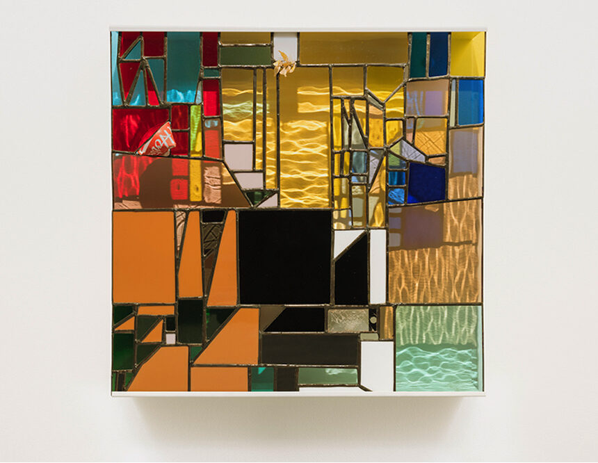
Knowles’s stained glass pieces are luminous elegies. The uniform titles of these works—Walking Spectrum II, i, S17 (2017), Walking Spectrum I, S17 (2017), Walking Spectrum II, ii, S17 (2017)—reflect their consistent technique. Square in aspect, and ranging in scale between the size of an LP sleeve and a small kitchen tabletop, the works have the look of shattered medieval windows, reconstructed into haphazardly elegant modern compositions. Alien materials have found their way into the fragmentary recompositions. Bits of popcorn, pebbles, disposable cups, and flowers poke out from between the glowing shards, suggesting the profaned material of ruined churches.
Incorporating these traces of the urban real, Knowles’s sculptures come the closest to echoing the conflict between fantasy and circumstance that runs through the architecture of a city like Vancouver. Much to Knowles’s credit, her use of these materials never suggests a desire to merely teach or telegraph concern. On the contrary, the work’s voice is made from eerie resonances. The sculptures’ true potential inheres in how they encourage imagination to fill out the story sketched by their materials and form. The historically religious space of stained glass collapses with the present moment, where glassed architecture has become entwined with the religion of capitalist development. The grit of Knowles’s aesthetic evinces a conflicted and anxious absorption of our present world, and its architecture.
To experience this work, in this city and at this time, is to experience a particular conflict between art and life. While they’re more dated (although very much 2019 Vancouver in their $60,000-70,000 ticket price), B.C. Binning’s schematic oil paintings are eccentrically magnetic. At a distance, Electronic Aesthetics (1957) resembles a diagram scaled up and reprinted from an electronic engineering textbook. Up close, the painting becomes a far-fetched translation of this utilitarian inspiration. A network of thin and colorful lines connects evokes cartoon impressions of electronic components. In the background, Binning’s quadrants of pastel color are scumbled over white. This technique causes the work to glow from within. But it is also a camp patina, industrial wear-and-tear pantomimed in paint.
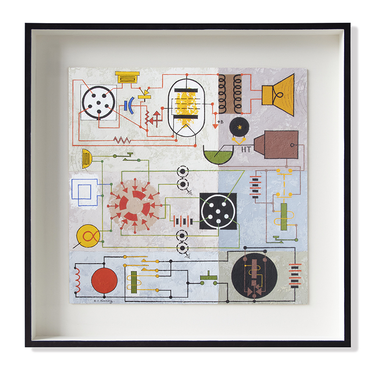
Binning’s painting, like the sculptures of Van Halm and Knowles, is a bittersweet pleasure. The sweetness owes to its innately satisfying formal rhythm, color, and light. The bitterness stems from how Binning’s playful use of utilitarian forms emphasizes the disjuncture between the whimsical and real connotations of architecture. That reality amounts to a widening gap between the utopian perspectives held in this work, and the quasi-Modernist architecture in which this city’s unequal development has been cast.
In this show, architectonic form glows most brightly within the medium of paint. Van Halm’s LB-SD-AA (2019), a horizontally oriented, medium-scale canvas, shows a dense stack of stripes—sometimes vibrantly colored and other times starkly black-and-white—revealed between curvaceous forms that block out the picture’s left and right sides, themselves in-filled with squares of rich color. While flatter than Binning’s, Van Halm’s barely translucent application of paint allows light to flicker through the picture. It’s like staring at a candy-striped wall in mid-afternoon; you’d like every surface in the world to be colored like this.
Architecture becomes extraterrestrial fantasy in Binning’s small painting Picture for Peter (1949). Several abutted triangles and rectangles occupy the picture’s central region. Curved edges, which enclose red, black, and yellow patterns, make these shapes into jaunty characters. Spindly black lines extend into the cream-colored ground like antennae. In the picture’s upper corners, two circles—one bisected with red and black, the other Naples yellow—suggests a double moon, or sun: Modernist abstraction, delivered with cosmic flourish.
It’s easy to imagine how in 1949, when Binning painted this picture, an architecture of vibrant and translucent planes, of volumetric rhythms and rhyming colors would have seemed futuristic, bold, and intoxicating. Through the intervening decades, these styles and methods have been incorporated into life, to ends both good and bad. In large part, Leave the Window Open is a show about this process. The dreamy objects inside this particular building become allegories for the way that fantastical things morph as they are used. In this case, the exigencies of the capitalized city hang in mind, over every blocked color, and every beguiling turn of shadow and light.


Contribute your thoughts by leaving a reply