
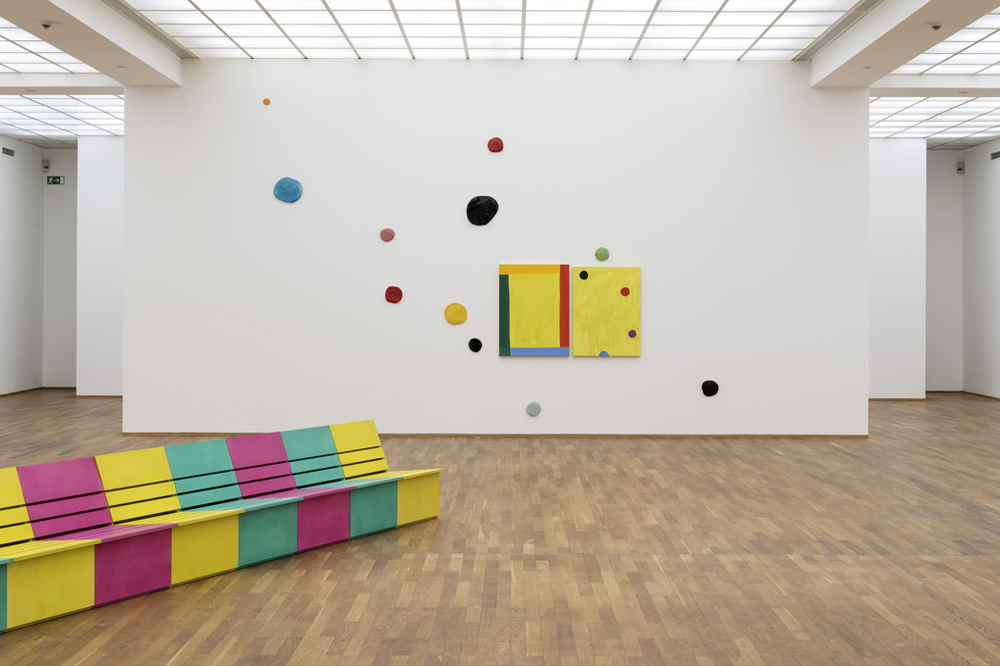


Once a train station, Berlin’s Hamburger Bahnhof museum now facilitates transportive experiences. There in a large hall, forty-five paintings currently hang in pairs, one David Reed for one Mary Heilmann. In this way, Two by Two proceeds in lock step with its title.
In 2007, Heilmann’s popularity ascended when, at the age of 67, she graced the covers of both Artforum and Art in America in the same month (November 2007). For that reason, her work is disproportionately extended by (my) prior knowledge. And in my head, there’s a sticky note attached to her paintings, reminding me to experience them not only as flourishes of color and structure, but as canny rejoinders to the moral seriousness that haunts mid-century abstract painting, in America. This formulation holds for both artists, but risks unfairly positioning them as respondents to history. Both painters (Heilmann is now 75; Reed is 69) riff off of two great peaks in Modernist painting – Abstract Expressionism and Color Field painting. But they do so with a cool reverence, which makes their movements as painters complex, and difficult to categorize. Two by Two forms a microscopic picture of this, and then does one better, bringing us to a strange place, where paintings can be kin.

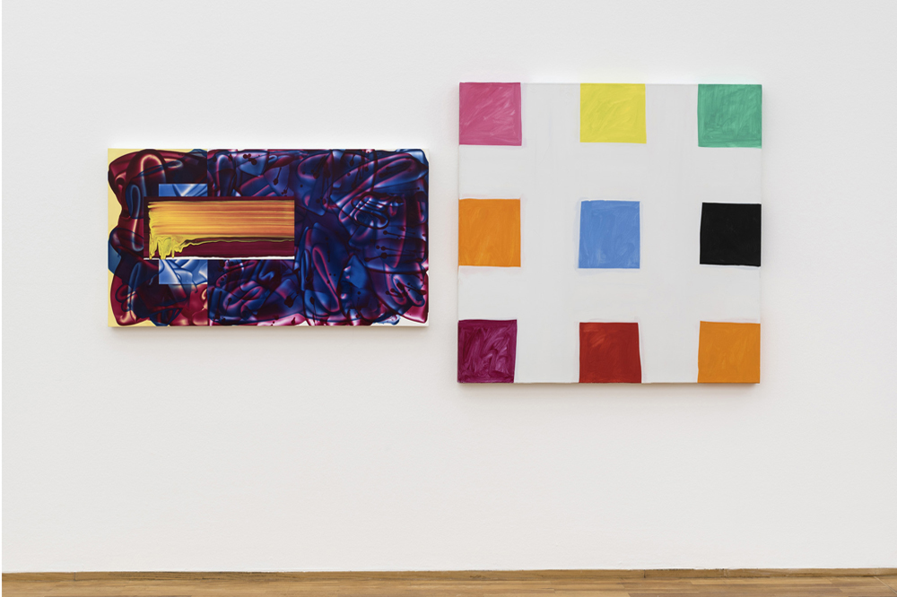
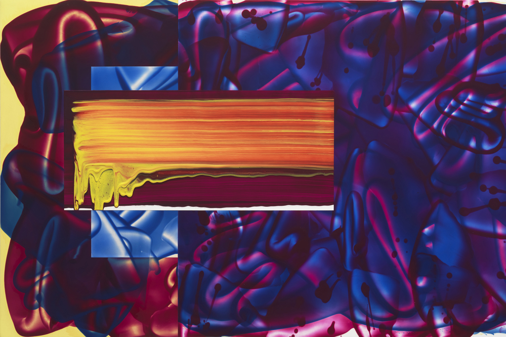
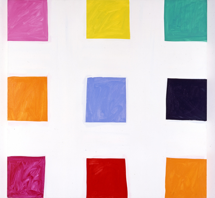
Consistently twinned, the two artists amplify one another like stereo frequencies. One pairing has Reed’s #636 (2010-13) next to Heilmann’s Cabrillo (1993). In the former, an amorphous shape made of brushstrokes that overlap and cut behind one another like flattened intestines, floats within and nudges against the boundaries of a horizontal rectangle. It’s hard to say if the paint is purple or red, or both. The painting’s construction – translucent brushstrokes over a ground of three rectangles of separate color – evades easy parsing. Closest to the picture plane, a smaller rectangle has a swath of orange and yellow pulled together, as if with a squeegee. The painting evokes sunsets and storms. Heilmann’s Cabrillo, on the other hand, combines the lightness of a sun-suffused curtain with the handmade solidity of an adobe hut. Spanning the canvas are four broad, wavering white bands, two horizontal and two vertical. The resultant grid opens up nine squares that are tremulous in shape but filled with tangerine, sour fuchsia, and diluted emerald, and delivers a chromatic charge.
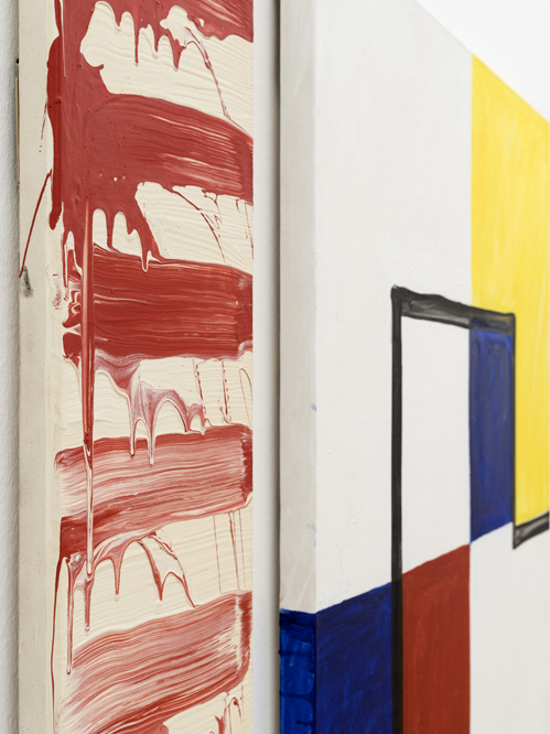
Reed and Heilmann are linked by their intense color, and their braiding of structure and fluidity. They diverge on the level of character. Heilmann’s opaque, wavy shapes are quietly and deliberately comedic. Reed’s folds and curls of paint are cool in their sexiness, like cigarette smoke. Over and again, within idiosyncratically long and narrow canvasses, Reed follows the brushstroke – about six inches across – into the fold, the arabesque, and then decorative blooms. Always, translucency discloses the illusion as illusion. In Heilmann’s paintings, a simple compositional structure – like a quadrant, say – often seems to have melted into three or four puddles of color. Rudimentary structures comprised of six or seven lines, meeting one another at angles, appear jotted in like a quickly-glimpsed spider web. In fact, this is the negative space produced by the efficient application of tape. Structure is intimated rather than rigorously built.
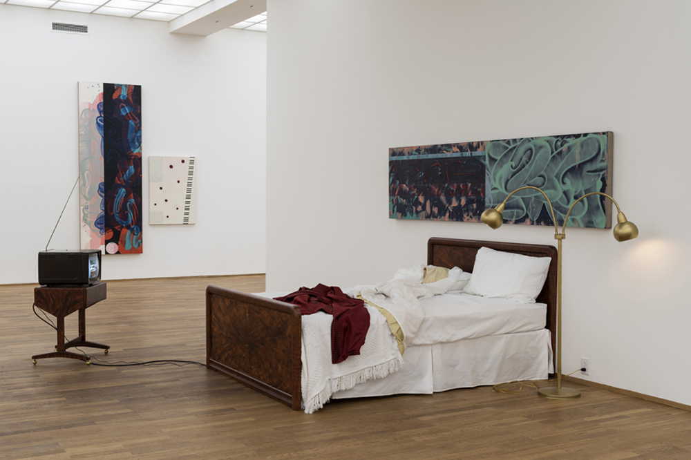
In her essay “Re-reading Barthes and Nabokov,” Zadie Smith describes the way in which a loved book, read and re-read, comes to resemble architecture. Having learned its layout, your imagination discovers previously unknown attics, closets, and crawl spaces. Two by Two encourages a similarly curious approach. It perforates the boundaries that contain our encounters with abstract painting within the visual and corporeal. To this end, Heilmann has contributed an audio work – A Vertigo Moment, 2015 – in which small speakers hidden near the ceiling issue re-mixed audio clips from Alfred Hitchcock’s Vertigo (1958), and a long, colorful bench – Sunny Chair #1-12 (2015) – on which to take in the show. Reed’s contribution, on this front, is an installation titled Scotty’s Bedroom (1994), wherein a vintage television set plays a looped scene from the same film, positioned before an empty bed, above which hangs his painting #522 (2002-04). The painting appeared tacky in this setting, as the aesthetic equal of a flickering television. One of Reed’s accomplishments, though, is to produce a condition wherein an adjective like “tacky” cannot leave your lips unexamined. His baroque folds and florescent colors remind us of decoration. But far from being frivolously indulgent, they are staunchly inhabited, inspiring belief in their power to enrich visual experience.
In many ways, both Heilmann and Reed emphatically dismiss certain conventions of artistic accomplishment. They are highly repetitive, and make decisions in ways that often seem more arbitrary than composed, with squiggles and puddles and grids overlaid, as if fallen together. On the other hand, both artists engage painting’s most persistently interesting nexus – where flatness and perspective twitch against one another – with extraordinary efficiency and specificity. In Heilmann’s Stevie’s Rip (2007), a checkerboard motif recedes upward form the painting’s lower edge, either colliding or sliding behind three billowing, dripping stripes of silver and blue, you can’t tell which. Because there’s no spatial context, the painting’s receding pattern persistently flips upwards. Reed plays this game in his own way. His painting #482 (2001-02) evokes depth by piling brushstrokes, brown, ribbon-y, and translucent. Looking at this is like lying beneath a pane of glass over which colorful fluid has just been spilt. Several hard-edged stripes, vertical and rectangular, here opaque and there translucent, populate the lower left and upper right corners of the painting. Recalling television test-patterns, they tension the picture on a diagonal axis, while reminding of the basic phenomena – color – out of which illusion is made.
Paintings like this one throw your understanding of space into elliptical cycles. Maybe this is why the works have been matched with Hitchcock’s Vertigo? Reed writes that, as a child, movies “taught me how to extend my body through media and architecture.” In the film, Hitchcock syncs the psychological and physiological disorientation of his protagonist Scotty (James Stewart) with innovative warps of film space. Vertigo popularized the dolly zoom, in which the subject’s face maintains its scale, with the background receding or coming forward. The film’s color – largely developed by costume designer Edith Head – further illuminates Reed and Heilmann’s affinity for the film. One scene demonstrates this well: Madeleine (Kim Novak) drifts through a place called Ernie’s Restaurant – that should be called Ernie’s Sultry Pleasure Club – with flourishes of gold (Novak’s hair), shimmering emerald (her dress), and carnal red (Ernie’s interior) as psychological drama. Likewise Scottie’s dream sequence, in which Stewart’s face, tinted lime green, floats over a deep purple vortex. The artist’s allusions to the film are slight. But they’re enough to cast the present paintings in a Technicolor light.
There’s also a populist intonation to the selection of Vertigo. Heilmann once wrote of her motivation to make art, that “yes, I did it in order to be someone.” Of course there’s being someone and there’s being someone. In order to be the latter, you have to become a kind of social kaleidoscope in which people can see themselves refracted and esteemed. As, arguably, everyone’s favorite Hitchcock film, Heilmann’s recent surge in popularity positions Reed as something of an underdog, here. For this reason, the title of Heilmann’s Good Vibrations Diptych/Remembering David (2012) is both touching and appropriate. In this work, two small paintings – yellow monochromes bordered by colored stripes and blotted by colored dots, in both cases red, orange, green, and periwinkle – hang within a constellation of wobbly ceramic discs, spanning the wall. Pictorial entities unbounded by the rectangle and hovering in the cusp between two and three dimensions, they buoy the exhibition with a drifting sensation.
My flow through Two by Two wasn’t always unimpeded. After about fifteen minutes, a repetitive telephone ring emanating from the video loop in Scottie’s Bedroom began to feel like a drop of water on my forehead. In order to lose myself in the large hall wherein the paintings hang like so many duets, I have to move through a dark room populated by two videos. One was Heilmann’s slideshow, Her Life, 2006; the other Pamela and David Reed’s video In Our Solitude, 2014. Pamela and David are siblings, and the video is primarily a montage of images from their childhood home in California, built by their uncle John August Reed, an architect who, though never a household name, designed elegant houses in a Modernist, post-and-beam style. The siblings made the film as a pre-emptive mourning ritual, knowing, as Reed cryptically explains in his accompanying essay, that family and home would soon part ways. Ushering viewers between two slideshows into the main exhibition, the purpose of this room was to prime the show with a nostalgic – or at least recollective – undertone. But that priming was unnecessary, as the exhibition generally operates like a memory palace by other means; one built from abstraction, with associations following sensory rather than pictorial cues.
Reverie, without which we’d be bereft, can produce blind spots that block out social rot. Heilmann and Reed float like moths towards the glowing aspects of Americana. Surfing, neon lights, high-school dances, and endless highways are both direct and alluded to features of her work. In his work there is glowing neon, the psychedelic swirl of smoke and lava lamps, sunset, roiling water, and cinema. Reed’s description of mourning the family home tugs at one’s chest. But that pull competes with the question: what is the demographic of people with the privilege of experiencing solitude, much less in a family home constructed by an architect worth mentioning by name? It’s difficult, maybe impossible, to display any one thing without invoking its opposite. This invocation of (seemingly) absent and adverse sentiments haunts Two by Two. It models social conviviality through painting, against a glowing California backdrop. But knowing that no place glows constantly, your mind drifts to the shadows. In the exhibition’s accompanying essay, Reed acknowledges this problem – and hints at the reason for his family’s loss of the home – by noting the latent hollowness of mid-century, middle-class American optimism. With uncanny effect, Two by Two frames a kind of enchantment that rolls in slowly, and breaks over you, again and again. In a perfect world, the conditions necessary to float carefree within it would drift as easily as color and shape do here.